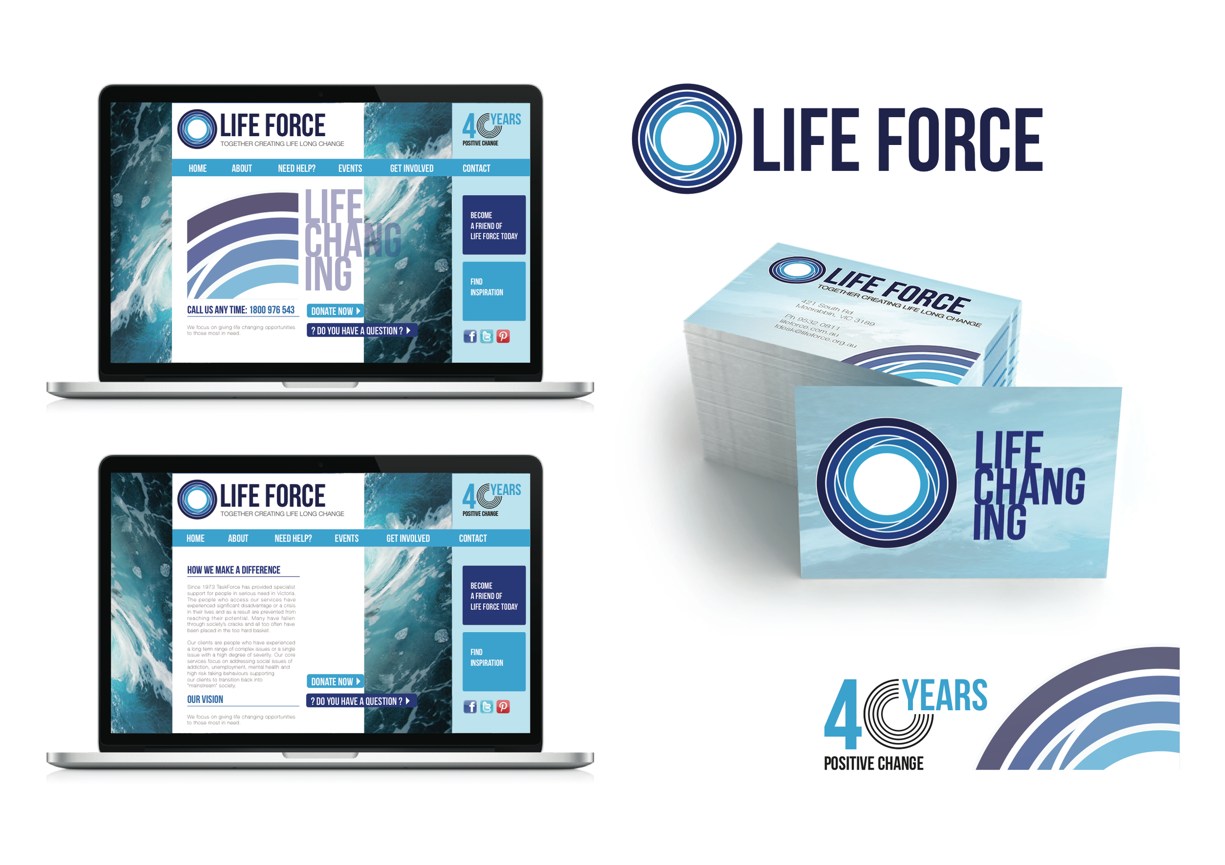
Task Force Community Agency - Rebranding
Rebranding for Task Force Community Agency, a charity organisation helping those who are disadvantage and most in need. The cleint was open to a new comapny name complete with new logo design and 40 years logo. The new company name Life Force communicates a more postive vibe whilst still maintaining the strength and action of the previous company name.
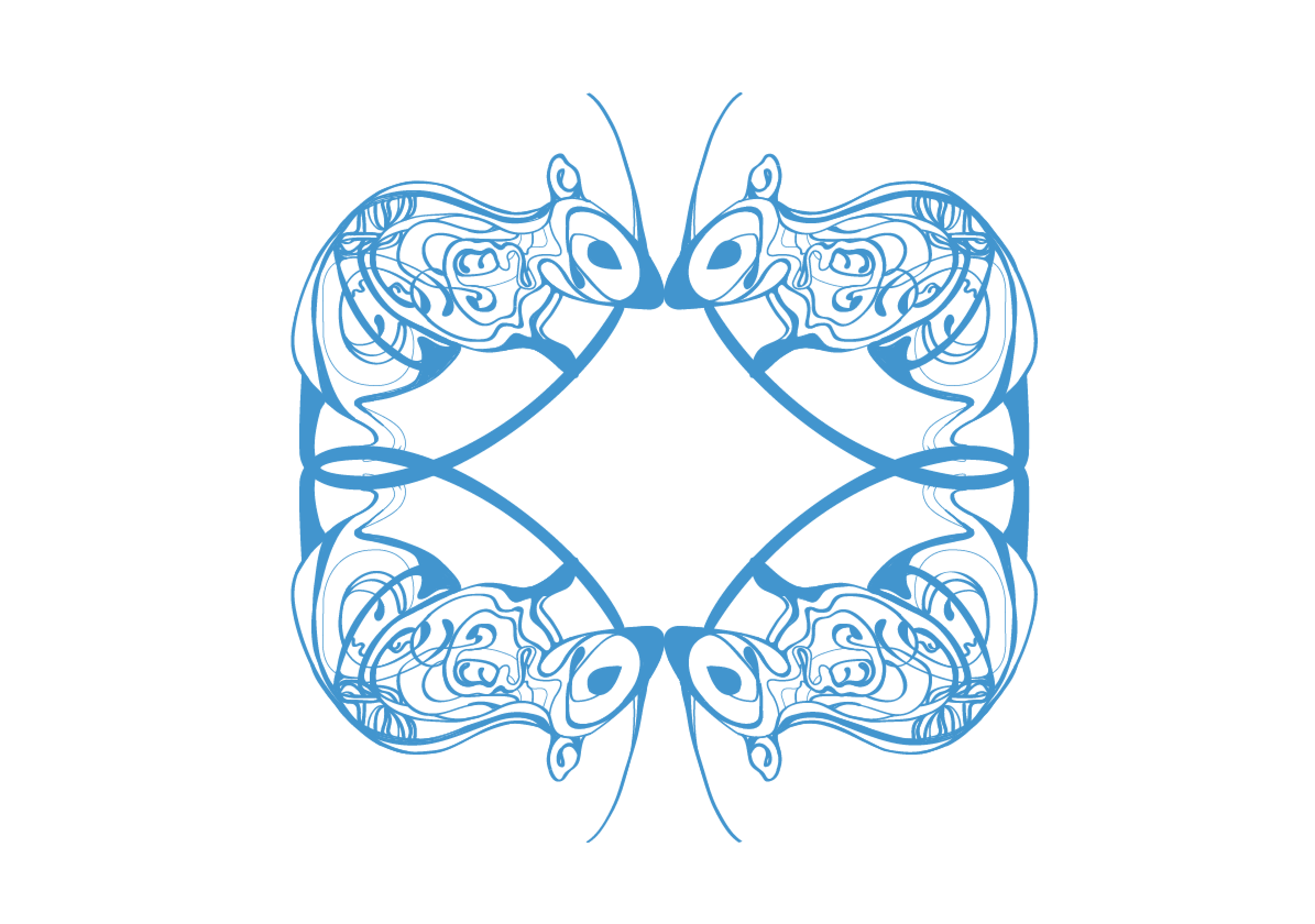
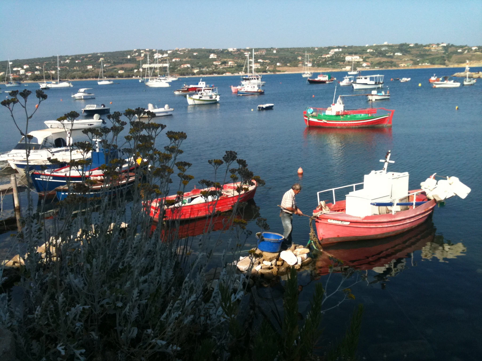
Life Force is defined as the influence that gives something its vitality and strength and provides the perfect analogy for the service Life Force provides. The logo design represents the cycles of change, breaking the downward spiral of addiction, providing light at the end of the tunnel. The logo has a positive and energetic motion which moves the eye towards the white circle in the centre of the logo, the white circle being a symbol of completion and peace. Water has been used as a secondary visual language for the brand, creating an atmosphere of cleansing positivity and calmness with a strong sense of vitality conveyed through the images correlting with the meaning of life force.